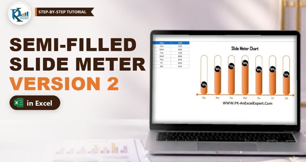
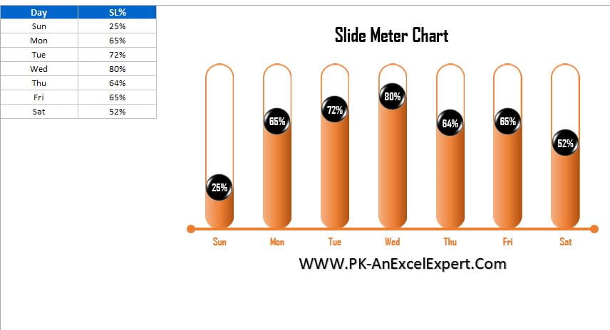
A semi-filled slide meter chart in Excel shows each KPI as an outlined, rounded track that fills up only to the value, like liquid in a tube. This is Version 2 of PK’s slide meter chart. In Version 1 the track was solid and a bubble slid along it; here the fill itself rises to the service level. The secret is one picture-fill setting, Stack and Scale, which cuts the rounded shape at the right height instead of squashing it. No VBA needed.
Watch the Video Tutorial
In the video PK builds the semi-filled version from scratch: two pill shapes, the Stack and Scale fill, 100% overlap, a second SL% series for the bubbles and an arrow-style axis line.
What You Will Build
- Outlined tracks: an orange-outlined, unfilled pill for every day (the 100% level).
- Semi-filled bars: a gradient pill that shows only up to the KPI value, thanks to Stack and Scale.
- Black glossy bubbles with white labels sitting at the top of each fill.
- A styled axis: a thick orange line with round end caps under the day names.
- A live chart: type a new percentage and the fill level changes immediately.
Set Up the Data
The data is a day-wise service level table like the one in Version 1 (only Sunday differs). In the video it sits in A1:B8: Day in column A (Sun to Sat) and SL% in column B (25%, 65%, 72%, 80%, 64%, 65%, 52%). Turn off gridlines from the View tab first.
Then add a helper column: type Max in C1 and 100% in C2:C8. A service level cannot be more than 100%, so Max describes the full height of each track.
Part 1: The Base Column Chart
Step 1: Insert a clustered column chart
Select the table and go to Insert › Charts › Column › 2-D Clustered Column. You get a blue SL% column and an orange Max column for each day.
Step 2: Lock the axis from 0 to 1
Right-click the vertical axis, choose Format Axis and set Minimum = 0 and Maximum = 1. This is essential for Version 2: the Stack and Scale trick in Part 3 assumes one picture equals exactly 1 (100%) on the axis. After that, delete the axis, the gridlines and the legend.
Step 3: Widen the columns
Right-click a column, open Format Data Series and reduce the Gap Width from 219% to about 80%.
Part 2: Create the Two Pill Shapes
Step 4: The filled pill
Go to Insert › Shapes › Rectangles › Rounded Rectangle and draw a tall, narrow shape. Drag the yellow handle to make the ends fully round. In Format Shape › Fill & Line choose Gradient fill, preset Medium Gradient – Accent 2 (orange), direction Linear Right (Linear Left also works), and set Line to No line.
Step 5: The outline pill
Copy the shape and paste a second one. On the Format tab set Shape Fill = No Fill and Shape Outline to the theme colour Orange, Accent 2 with a weight of 1.5 pt. You now have a solid orange pill and an empty orange outline of the same size.
Step 6: Paste the shapes into the series
- Copy the filled pill, click once on the SL% series and press
Ctrl+V. - Copy the outline pill, click once on the Max series and press
Ctrl+V.
At this point every SL% column still shows a whole pill squeezed to its height. Part 3 fixes that.
Part 3: The Semi-Filled Slide Meter Chart Trick
Step 7: Use Stack and Scale with 1 unit per picture
Right-click the SL% series and choose Format Data Series › Fill & Line › Fill. Picture or texture fill is already selected because you pasted a shape. Scroll down and choose Stack and Scale with, with Units/Picture = 1. Select the Max series and set the same option, again with 1.
Why it works: with Stack and Scale, Excel draws one copy of the picture for every 1 unit on the axis. The axis runs from 0 to 1, so one full pill equals 100%. A 25% column shows only the bottom quarter of the pill, an 80% column shows the bottom 80%, and the rounded bottom end keeps its shape instead of being squashed.
Step 8: Overlap the series 100%
Still in Format Data Series, open Series Options. The Series Overlap is -27%; drag it to 100%. The filled column now sits inside its outlined track, so each day looks like a tube filled to its value.
Part 4: Add the Value Bubbles
Step 9: Add SL% a second time
Copy the SL% range including its header (B1:B8), click the chart and press Ctrl+V. Excel adds a third series, also named SL%, as grey columns.
Step 10: Make it a line with markers
Right-click the grey series and choose Change Series Chart Type. In the combo list you will see SL% twice; set the new one to Line with Markers and click OK. Then select the line and choose Format › Shape Outline › No Outline, so only the markers remain, one at the top of each fill.
Step 11: Create the black bubble
Insert an Oval from Basic Shapes. Set Shape Fill to black and Shape Outline to No Outline. Apply Shape Effects › Preset › Preset 5 for the glossy look, then Shape Effects › Shadow › No Shadow. Set its height and width to 0.4 so it fits the track.
Step 12: Paste it on the markers and add labels
Copy the oval, click the markers and press Ctrl+V. Right-click a bubble, choose Add Data Labels, then open Format Data Labels and set Label Position = Center. Make the labels white, bold and a little bigger.
Part 5: Finish the Design
Step 13: Style the axis line
Select the horizontal axis. Give the labels the same orange theme colour, bold, and a slightly larger size. Then use Format › Shape Outline to set the axis line to the same orange, Weight = 3 pt, and under Arrows pick Arrow Style 11, which puts a round dot on both ends.
Step 14: Add a title
Type a chart title such as Service Level by Days and format it bold in the same orange. Change any SL% value to test it: the fill and the bubble move together.
How the chart works
- Max series: always 100%, outline-only pill = the empty track.
- SL% series (columns): gradient pill with Stack and Scale 1, so the visible part equals the value.
- Overlap 100%: puts the fill inside the track.
- SL% series (line with markers): invisible line, black bubbles with centred labels at the value.
Common Errors and Fixes
The pill looks squashed instead of cut
The SL% fill is set to Stretch. Change it to Stack and Scale with and set Units/Picture to 1.
The fill shows several small pills stacked on top of each other
Units/Picture is smaller than 1, so Excel draws more than one pill per 100%. Set Units/Picture to 1 on both series, and keep the axis locked at 0 to 1 so the full track reaches the top.
The fill sits next to the track, not inside it
Series Overlap is still negative. Set it to 100% in Series Options.
Paste added a new series in the wrong place
Make sure you clicked the chart area (not a single series) before pasting the B1:B8 range, or use Select Data › Add and pick the same range.
Tips
- Pick any preset gradient for the filled pill and match the outline colour, so the chart fits your Excel dashboard theme.
- Good KPIs for this chart: Service Level %, Quality Score or Sales Conversion %, anything between 0% and 100%.
- Keep both pills the same size before pasting, otherwise the rounded tops will not line up.
- Microsoft explains picture fills for chart elements in Use a picture in a chart.
The Slide Meter Chart Series
- Slide Meter Chart in Excel (Version 1): solid tracks with a sliding bubble.
- Slide Meter Chart with Target-Based Conditional Formatting (Version 3): add a target and turn bars red or green automatically.
Want It Ready-Made?
If you want the finished file to drop your numbers into, the Slide Meter Chart (Version-2) template is available on NextGenTemplates.com, and you can browse more Excel templates there. To learn charts, infographics and dashboards in a structured way, try Excel Pivot Tables & Dashboards: Basic to Advanced on NextGenTemplates Academy.
Related Tutorials
- Candle Infographic Chart in Excel
- Convert a Boring Bar Chart into Stylish Charts
- Dynamic Sales Score Meter Chart
- Filling Circle Chart in Excel: KPI Infographic Without VBA
Frequently Asked Questions
What is a semi-filled slide meter chart?
It is a KPI chart where every category has an outlined pill-shaped track, and the track is filled only up to the KPI value. A 65% day is filled about two thirds of the way, with a round label marking the level.
How is Version 2 different from Version 1?
In Version 1 the whole track is solid and a bubble slides along it. In Version 2 the track is an outline and the fill rises to the value, which makes the gap to 100% easy to see.
Why does the fill not stretch the rounded shape?
Because the picture fill uses Stack and Scale with 1 unit per picture. With the axis fixed from 0 to 1, one full picture equals 100%, so a 65% column shows only the bottom 65% of the pill instead of squeezing the whole shape.
Why do I add the SL% data to the chart a second time?
The first SL% series is the filled column. The second copy is turned into a line with markers, and its markers become the black bubbles that carry the data labels at the top of each fill.
Can I use this chart for other KPIs?
Yes. It works for any value between 0% and 100%, such as quality score, sales conversion or utilisation. Replace the day names and percentages with your own data and the chart refills itself.
Does this chart need VBA?
No. It uses a clustered column chart, a line with markers, pasted shapes and picture fill options only.
About the Author
PK is a Microsoft Excel expert and trainer and the founder of PK: An Excel Expert and NextGenTemplates.com. He has been teaching Excel, Power Query and Power BI since 2016 on his YouTube channel.
Conclusion
The semi-filled slide meter chart takes the Version 1 idea one step further: an outlined track for 100%, a gradient fill cut to the exact value with Stack and Scale, and a bubble that shows the number. Once you understand that one fill setting, you can turn almost any shape into a fill-up KPI chart. Next, add a target and automatic red and green colours in Version 3.