Part of the free Module 10: Pivot Tables · Lesson 5 of 20 · Full Excel course
Updated on 5 September 2026 · Works in Excel 365, 2021, 2019 and 2016 unless noted.
Adding a field to the Columns area turns a one-dimensional list into a two-dimensional pivot table, also called a cross-tab or matrix report. Row items run down the left, column items run across the top, and every cell shows the value where the two meet. This lesson covers columns in a pivot table from the first drag to nested levels, blank cells and totals.
Columns area versus Rows area
The Rows and Columns areas do the same job in different directions. Both group the data by the unique items of a field; the only difference is whether those items become headings down the side or across the top. Excel summarises the Values field at every intersection and adds Grand Totals on the right and along the bottom. Which area a field belongs in depends on how many items it has and how the report will be read.
| Question | Rows area | Columns area |
|---|---|---|
| How many items does it handle well? | Dozens or hundreds; the report simply grows downward | Roughly 3 to 15; more than that scrolls off screen |
| Typical fields | Employee, customer, account code, product list | Year, quarter, month, region, product group, status |
| Header drop-down | Row Labels | Column Labels |
| Sorting | Top to bottom, A to Z or by value | Left to right; use Sort > More Sort Options > Left to Right for values |
| Grand Total position | Bottom row | Right-hand column |
| Printing | Repeats neatly over many pages | Wide reports break awkwardly across pages |
A useful rule: put the field you want to compare within a line across the top. Supervisors down the side and products across the top lets you read one supervisor’s product mix in a single row.
How to build a two-dimensional cross-tab report
- Click inside the pivot table so the PivotTable Fields pane appears. If the pane is hidden, choose PivotTable Analyze > Show > Field List.
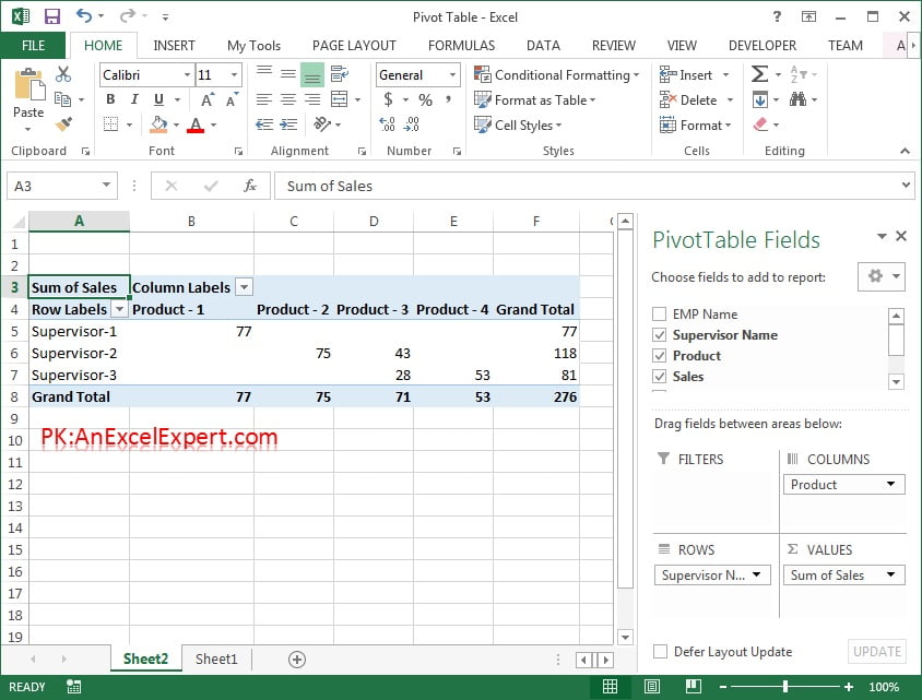
- Drag Supervisor Name into the Rows area. You now have one line per supervisor.
- Drag Product into the Columns area. Product – 1 to Product – 4 spread across the top of the report as column headings.
- Drag Sales into the Values area. Every cell now shows the units that supervisor sold of that product, with a Grand Total column on the right and a Grand Total row at the bottom.
- Check the corner cell. It reads Sum of Sales, the summary shown at each intersection; double-click it to change the calculation.
Adding more than one column field
Drag a second field underneath the first one in the Columns box and Excel nests the two levels, outer field on top and inner field below it. Drag Date below Product and each product splits into years; in Excel 365, 2021, 2019 and 2016 the date field is grouped into Years and Quarters automatically when you drop it.
The order inside the Columns box controls the hierarchy. Drag Date above Product and you get years first, each divided by product. Column fields are always nested, never side by side, so plan the outer field carefully: it is the one whose subtotals you will read most often. Keep the count sensible, because two levels of four items already produce sixteen data columns plus subtotals and the Grand Total.
Collapsing and expanding column groups
Once a column field is nested, each outer heading gets a plus or minus button. Click the minus to collapse a product to its subtotal and the plus to open it again. Three faster ways:
- Right-click any column heading and choose Expand/Collapse > Collapse Entire Field to fold every item at that level at once.
- Use PivotTable Analyze > Active Field > Collapse Field or Expand Field after clicking a heading in the level you want.
- Press Alt then Shift then the minus key to collapse the active field and Alt then Shift then the plus key to expand it.
If the buttons are missing, switch them on with PivotTable Analyze > Show > +/- Buttons. Hiding them suits a finished report.
Moving fields between areas
Nothing has to be rebuilt when you change your mind. Three ways to move a field:
- Drag it in the Fields pane. Pull Product out of Columns into Rows and Supervisor Name out of Rows into Columns. The report flips immediately.
- Use the field menu. Click the field name in an area box and choose Move to Row Labels, Move to Column Labels, Move to Report Filter or Move to Values.
- Drag inside the report. Drag a column heading into the row area of the grid and Excel repositions the field where you drop it.
Dragging a field outside the pane, or unticking it in the field list, removes it from the report. The source data is never affected, so swapping orientation costs a few seconds.
The Values (Sigma) field in columns or rows
Place a second field in the Values area and Excel creates a pseudo-field called Σ Values in Columns. It is not a field from your data; it is a placeholder that decides where the measure headings sit.
| Σ Values position | What the report looks like | Best for |
|---|---|---|
| Columns (default) | Sum of Sales and Sum of Revenue sit side by side under each product heading | Comparing two measures for the same item at a glance |
| Rows | Sum of Sales and Sum of Revenue stack vertically under each supervisor | Narrow, printable reports and three or more measures |
| Above or below another field | Measure headings move outside or inside the other column field | Grouping all Sales columns together rather than by product |
Drag Σ Values to Rows to stack the measures, or above and below Product inside the Columns box to change which heading comes first. With a single value field it does not appear at all, because there is nothing to arrange.
Blank cells and For empty cells show
A cross-tab makes gaps visible. If a supervisor sold nothing of Product – 3 that intersection is empty, because a pivot table only reports combinations that exist in the source data. Blanks look unfinished and break some charts.
- Right-click anywhere in the pivot table and choose PivotTable Options.
- On the Layout & Format tab, tick For empty cells show.
- Type
0in the box for a numeric report, or a dash for a printed one. - Click OK. The setting covers the whole pivot table and survives a refresh.
Note the difference between an empty cell and a zero. Zero means the transaction happened and totalled nothing; blank means there was no transaction. Replacing blanks with 0 is a display choice, so say which convention you used.
Worked example
A small extract of the practice data:
| Supervisor Name | Product | Sales |
|---|---|---|
| Supervisor A | Product – 1 | 120 |
| Supervisor A | Product – 2 | 80 |
| Supervisor B | Product – 1 | 65 |
| Supervisor B | Product – 3 | 140 |
Put Supervisor Name in Rows, Product in Columns and Sales in Values. The result is a four-column grid:
| Sum of Sales | Product – 1 | Product – 2 | Product – 3 | Grand Total |
|---|---|---|---|---|
| Supervisor A | 120 | 80 | 0 | 200 |
| Supervisor B | 65 | 0 | 140 | 205 |
| Grand Total | 185 | 80 | 140 | 405 |
The two zeros were blank until For empty cells show was set to 0. Both Grand Totals agree at 405, the quickest check that nothing has been filtered by accident.
Tips and common mistakes
- Too many column items. A field with dozens of items is unreadable and unprintable. Move it to Rows, group it, or filter it from the Column Labels drop-down.
- Column widths jump on every refresh. Untick Autofit column widths on update in PivotTable Options to keep the widths you set.
- Dates split into Years and Quarters unexpectedly. That is automatic date grouping; right-click a date heading and choose Ungroup.
- Wrong field on the outside. The first field in the Columns box drives the subtotals. Reorder the box rather than rebuilding the pivot table.
- Missing Σ Values item. It only exists when two or more fields sit in the Values area; add a second measure and it appears.
- Hidden filter on a column field. A funnel icon on the Column Labels drop-down means items are excluded, so the Grand Total is understated. Clear it from PivotTable Analyze > Clear > Clear Filters.
Practice exercise
Download the course practice file, Pivot-Table.xlsx, and work through these tasks.
- Build the report above and confirm both Grand Totals match.
- Swap the two fields so products run down the side and supervisors across the top, and decide which reads better.
- Replace Product with Date in Columns to build a supervisor-by-month matrix, then collapse every year.
- Add Revenue to Values, move Σ Values from Columns to Rows and compare the layouts.
- Set For empty cells show to 0, then turn the column Grand Total off from Design > Grand Totals.
Key takeaways
- Rows and Columns group data the same way; only the direction differs, so fields move freely between them.
- Give the Columns area a short field of roughly 3 to 15 items and keep long lists in Rows.
- Several column fields nest into levels you can collapse and expand with the plus and minus buttons.
- The Σ Values item appears with two or more value fields and controls whether measures sit side by side or stacked.
- A blank cell means no matching records; For empty cells show replaces it with 0 or a dash.
Related lessons
- Group dates and text into months, quarters and years
- Report Layout: compact, outline and tabular forms
- Subtotals and Grand Totals in a pivot table
- Value Field Settings: Sum, Average, Count and percentage share
- Pivot Table course hub
- Excel Dashboard module
- Microsoft Support: Create a PivotTable to analyse worksheet data
Frequently asked questions
How do I add multiple columns to a pivot table?
Drag a second field into the Columns box underneath the first one. Excel nests the two levels, outer field above inner field, and adds plus and minus buttons so each group can be collapsed. The order inside the box sets the hierarchy, so drag the fields up or down to change which one is on the outside.
What is the difference between the Rows area and the Columns area?
None in the way the data is calculated. Both group the records by the unique items of a field. Rows lists those items down the left and grows downward, which suits long lists and printing. Columns spreads them across the top, which suits short lists you want to compare side by side within one line.
Why do my Sales and Revenue fields appear across the top?
When two or more fields sit in the Values area, Excel adds the Σ Values placeholder to the Columns area and shows the measure headings there. Drag Σ Values into the Rows box to stack the measures vertically under each row item instead, which keeps a multi-measure report narrow enough to print.
How do I replace blank cells in a pivot table with zero?
Right-click the pivot table, choose PivotTable Options, and on the Layout and Format tab tick For empty cells show and type 0. The setting covers the whole report and survives a refresh. Remember that a blank means no matching records, while a real zero means the records exist and total nothing.
Can two column fields sit side by side rather than nested?
Not in one pivot table; column fields are always hierarchical. Build two pivot tables from the same source, place them next to each other and connect them with a shared slicer, or use a Data Model pivot table with a separate measure for each comparison you need in its own column.
Want the finished version? Ready-made Excel dashboards, trackers and VBA systems are available at NextGenTemplates.com.