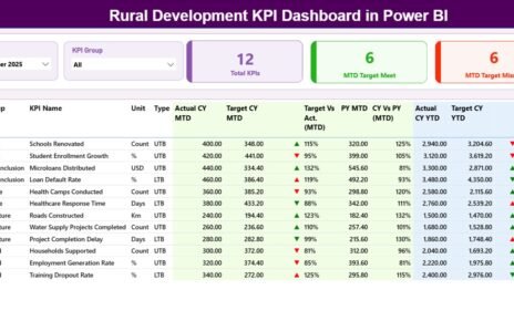
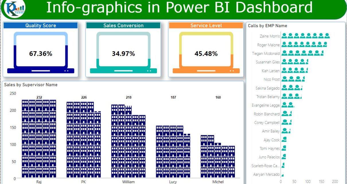
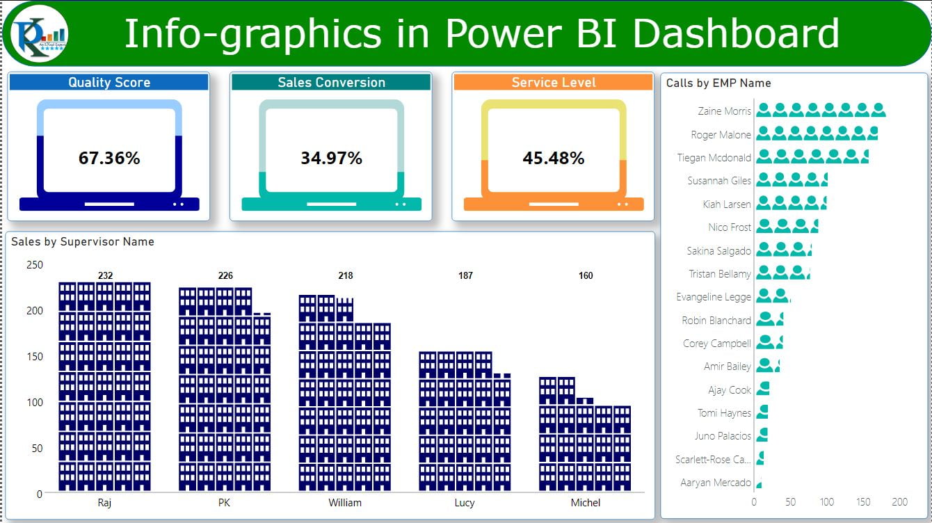
In this article, you will learn how to use Infographic Designer Visual in Power BI. This Visual can improve the beauty of your Power BI Dashboards. Using this Visual, we have created Cards, Column Chart and Bar chart with infographics icon in the Chart.
Infographics in Power BI dashboard
18
Apr 2021
6687Comments Off on Infographics in Power BI dashboard
PK
Meet PK, the founder of PK-AnExcelExpert.com! With over 15 years of experience in Data Visualization, Excel Automation, and dashboard creation. PK is a Microsoft Certified Professional who has a passion for all things in Excel. PK loves to explore new and innovative ways to use Excel and is always eager to share his knowledge with others. With an eye for detail and a commitment to excellence, PK has become a go-to expert in the world of Excel. Whether you're looking to create stunning visualizations or streamline your workflow with automation, PK has the skills and expertise to help you succeed. Join the many satisfied clients who have benefited from PK's services and see how he can take your Excel skills to the next level!
https://www.pk-anexcelexpert.com
Related Articles
Product Review Dashboard in Power BI
Introduction In an era where data is king, it's crucial to have efficient tools that help businesses draw insightful conclusions
Quality Analysis Dashboard in Power BI
In the article, we have created a beautiful Quality Analysis Dashboard in Microsoft Power BI. We have used sample data
Custom Visual: Liquid Fill Gauge in Power BI
Liquid Fill Gauge is very beautiful Custom visual for Power BI. You can use this chart to display metrics like