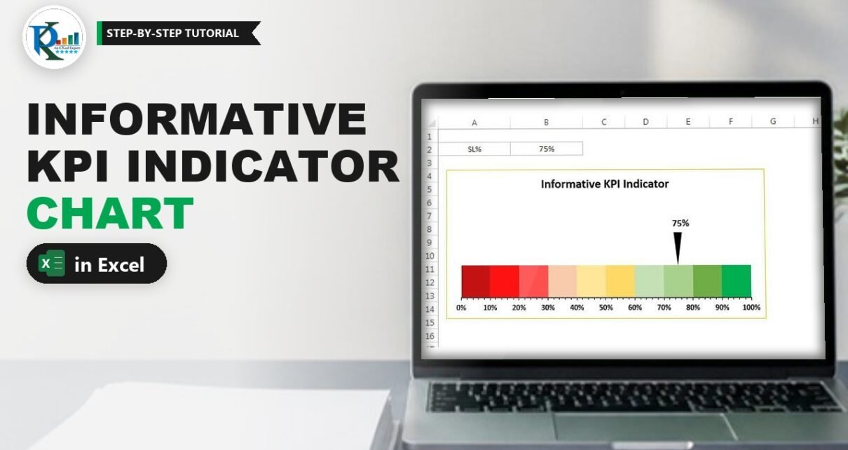
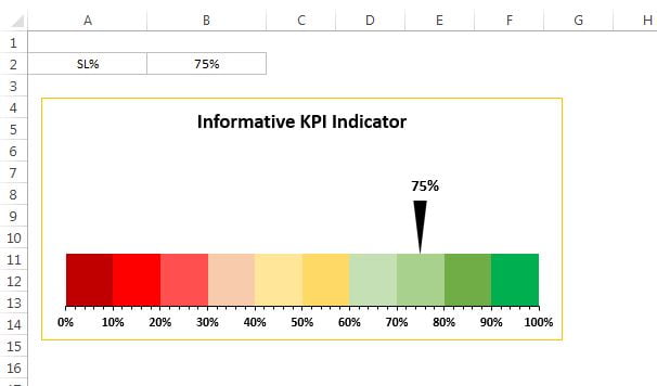
An informative KPI indicator chart shows a single KPI on a red-amber-green scale with an arrow that points to the current value. PK builds it on ten 10% slices, from dark red at 0% to dark green at 100%, using service level as the example metric. Type a new percentage and the arrow slides to it straight away. It needs one stacked bar chart, two short formulas and a triangle shape, with no VBA. This is Version 1 of the chart; Version 2 adds a target that turns the arrow red or green.
Watch the Video Tutorial
In the video PK sets up the Slices and Indicator rows, builds a stacked bar chart, explains the 1.02 axis maximum, colours the ten slices and pastes a flipped triangle onto the 3% indicator point.
What You Will Build
- A KPI cell (service level) that drives the whole chart.
- A Slices row of ten 10% blocks that form the red-amber-green scale.
- An Indicator row that positions a 3% wide arrow exactly on the KPI value.
- A stacked bar chart with a 0 to 102% axis and outside tick marks.
- A black arrow with a live label linked to the KPI cell.
Part 1: Set Up the KPI Indicator Data
Step 1: Enter the KPI
On a new sheet, turn off gridlines from the View tab. Type SL% in A1 and the service level in B1, for example 75%. (The screenshot above keeps the KPI one row lower, in A2:B2; the video uses row 1, which is what the formulas below follow.)
Step 2: Build the Slices row
Type Slices in A2 and enter 10% in each cell from B2 to K2. Ten slices of 10% make the full 0-100% scale, and each one will get its own colour.
Step 3: Build the Indicator row
Type Indicator in A3, then fill B3:D3 like this:
C3  3%
B3  =B1-C3/2
D3  =100%-SUM(B3:C3)
How the formulas work
C3is the width of the arrow. PK uses 3%; you can try 4% or 5% for a wider arrow.B3is an invisible spacer that ends half an arrow before the KPI. With 75% and a 3% arrow it returns 73.50%, so the arrow runs from 73.5% to 76.5% and its centre lands on 75%.D3is the invisible remainder that brings the row to 100%, here 23.50%.
Change B1 and only B3 and D3 change. The arrow segment keeps its width and simply slides along the bar.
Part 2: Build the Stacked Bar Chart
Step 4: Insert the chart and switch rows and columns
Select A2:K3 and go to Insert › Charts › Bar › 2-D Stacked Bar. Right-click the chart, choose Select Data, click Switch Row/Column and click OK. You now have two bars: one made of the ten slices and one made of the three indicator parts.
Step 5: Clean up and set the axis
Delete the legend, the gridlines and the vertical axis. Right-click the horizontal axis and choose Format Axis:
- Minimum: 0
- Maximum: 1.02
- Major unit: 0.1
- Tick Marks: Major type Outside and Minor type Outside
Why 1.02? The arrow is 3% wide, so half of it is 1.5%. At a KPI of 100% that half would hang past the end of a 100% axis and be cut off. A 102% maximum keeps the whole arrow visible.
Step 6: Remove the gaps
Right-click a bar, choose Format Data Series and set Gap Width to 0. Resize the plot area and the chart to the shape you want. Make the axis labels black and bold, and set the axis line’s Shape Outline to black.
Part 3: Colour the RAG Scale
Step 7: Hide the spacer parts
On the Indicator bar, click once to select the series and again to select only the first part, then set Fill › No fill. Do the same for the last part. Only the small 3% segment is left visible.
Step 8: Fill the ten slices
Select each slice on its own and give it a Solid fill. Go from dark red for 0-10%, then red, a lighter red, through light orange and yellow tones in the middle, to light green, a darker green and the darkest green for 90-100%. The screenshot shows the full palette: three reds, three amber shades and four greens.
Part 4: Add the Arrow and Label
Step 9: Make the arrow
Go to Insert › Shapes › Basic Shapes and draw a triangle. On the Format tab choose Rotate › Flip Vertical so it points down. Resize it to a tall, thin arrow, set Shape Outline to No Outline and Shape Fill to black.
Copy the triangle with Ctrl+C, select only the 3% indicator segment in the chart and press Ctrl+V. The segment turns into the arrow.
Step 10: Link the label to the KPI
Right-click the arrow and choose Add Data Label. It shows 3%, the width of the segment. Click the label, type = in the formula bar, click B1 and press Enter, so the label reads the service level. Drag it above the arrow and make it bold, larger and black. Add a title such as Informative KPI Indicator.
Step 11: Test it
Type 85, then 15, then 100 in B1. The arrow and its label move each time, and at 100% the full arrow is still visible thanks to the 1.02 axis maximum.
Common Errors and Fixes
These fixes are general guidance based on how the chart is built.
You get ten bars instead of two
Excel plotted the data by column. Open Select Data and click Switch Row/Column.
The arrow is not centred on the value
The spacer formula is missing the half-width. B3 must subtract C3/2, not the whole of C3.
The arrow is cut off at 100%
The axis maximum is 1 or Auto. Set it to 1.02, or to 1 plus half your arrow width if you made the arrow wider.
The label shows 3% instead of the KPI
The label still reads its own segment value. Link it to B1 through the formula bar.
Tips
- If your KPI can go above 100% or below 0%, cap the input before it reaches
B3, for example by wrapping the KPI in MIN and MAX so it stays between 0% and 100% (our addition, not in the video). - A wider arrow needs a larger axis maximum: use 1 plus half the arrow width.
- Keep the colours in the same order as your business rule, so red always means bad and green always means good.
- Copy the whole chart for each KPI on a dashboard and point each copy at its own KPI cell.
- Microsoft’s page on the MAX function covers the capping formula mentioned above.
The Informative KPI Indicator Series
- Version 1 (this tutorial): RAG scale with a black arrow.
- Informative KPI Indicator Chart Version 2: adds a target, so the arrow turns red below target and green at or above it.
Want It Ready-Made?
If you would rather plug in your own KPI straight away, the Informative KPI Indicator Chart (Version-1) and the target-based Version-2 are available on NextGenTemplates.com, together with more Excel chart templates. To build KPI visuals and dashboards from scratch, take Excel Pivot Tables & Dashboards on NextGenTemplates Academy.
Related Tutorials
- 3D KPI Indicator in Excel
- Dynamic KPI Indicator with SEQUENCE and CEILING
- RAG Conditional Formatting in a Progress Circle Chart
- RAG (Red, Amber and Green) Analysis Chart in Excel
- Daily Sales Dashboard in Excel
Frequently Asked Questions
What is an informative KPI indicator chart?
It is a single stacked bar split into ten 10% slices coloured from dark red to dark green, with a black arrow that points to the current KPI value. It shows the number and how good or bad that number is in one glance.
How does the arrow move when the value changes?
The Indicator row has three parts: an invisible segment that ends just before the value, a 3% segment that carries the arrow, and an invisible remainder. The first part is the KPI minus half the arrow width, so the centre of the arrow always sits exactly on the KPI value.
Why is the axis maximum 1.02 and not 1?
The arrow is 3% wide, so half of it is 1.5%. At a KPI of 100% that half would fall past the end of a 100% axis and be cut off. A maximum of 102% leaves room for the full arrow.
Can I use a KPI other than service level?
Yes. Any percentage KPI between 0% and 100% works, for example quality score, on-time delivery or target achievement. Just change the label in A1 and the value in B1.
What does Version 2 add?
Version 2 adds a target. When the actual value is below the target the arrow turns red, and when it meets the target the arrow turns green. The RAG slices stay the same.
Does the chart need VBA?
No. It uses two simple formulas, a stacked bar chart, a triangle shape and a data label linked to the KPI cell.
About the Author
PK is a Microsoft Excel expert and trainer and the founder of PK: An Excel Expert and NextGenTemplates.com. He has been teaching Excel, VBA, Power Query and Power BI since 2016 on his YouTube channel.
Conclusion
The informative KPI indicator chart packs a number and its meaning into one small visual. Ten 10% slices give the red-amber-green scale, a three-part Indicator row places a 3% arrow exactly on the KPI, and a 1.02 axis maximum keeps the arrow whole at 100%. Link the label to your KPI cell and the chart updates itself. When you are ready to add a target, move on to Version 2.