Part of the free Module 10: Pivot Tables · Lesson 9 of 20 · Full Excel course
Updated on 5 September 2026 · Works in Excel 365, 2021, 2019 and 2016 unless noted.
A pivot chart in Excel is a chart that is bound to a pivot table instead of a fixed cell range, so it redraws itself the moment you filter, sort, group or rearrange the report behind it. It also carries its own grey field buttons for filtering. This lesson shows how to create a pivot chart, how the chart mirrors the pivot layout, how to hide the field buttons and which chart types are not allowed.
What a pivot chart is and when to use one
A normal chart points at a range such as B3:C8. A pivot chart points at a PivotTable object, so its series and categories are whatever the pivot table currently shows. Drag a new field into Rows, apply a Top 10 filter, group dates by month or click a slicer, and the chart follows without any reselection of data. That is why pivot charts are the standard building block of interactive dashboards: one set of slicers can drive several pivot charts at once.
Use a pivot chart when the shape of the data changes, when you want filtering on the chart itself, or when you are assembling a dashboard. Use a normal chart for a static visual, for full formatting freedom, or when you need a type that pivot charts do not support.
Two ways to create a pivot chart
Excel gives you two entry points. Which one you pick depends on whether the pivot table already exists.
| Method | Ribbon path | Starts from | Result |
|---|---|---|---|
| From an existing pivot table | PivotTable Analyze > Tools > PivotChart | A pivot table you have already built | A chart linked to that table, on the same sheet |
| Table and chart together | Insert > Charts > PivotChart > PivotChart & PivotTable | Raw data or an Excel Table | A new empty pivot table plus its chart, both built as you drag fields |
| Chart only, new pivot | Insert > Charts > PivotChart | Raw data or an Excel Table | A pivot chart with a hidden supporting pivot cache; no visible table |
| Keyboard | Alt+F1 with a cell in the pivot table selected | An existing pivot table | The default clustered column pivot chart, no dialog |
We start with a product-wise pivot table that shows Sum of Revenue for four products.
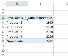
- Click any cell inside the pivot table.
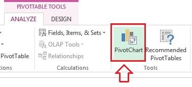
- Open the PivotTable Analyze tab (named Analyze in Excel 2013 and 2016, Options in Excel 2010) and click PivotChart in the Tools group.
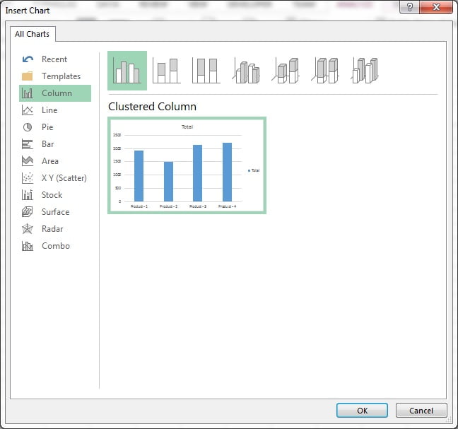
- In the Insert Chart dialog pick a chart type. Clustered Column, Bar, Line, Area, Pie and Combo are the usual choices for pivot data. Click OK.
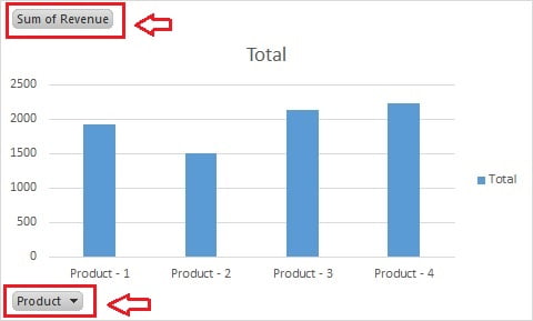
- The pivot chart appears beside the table with its field buttons visible: Sum of Revenue at the top left, Product at the bottom with a filter arrow, and a legend button on the right when a Columns field exists.
How the chart mirrors the pivot table layout
Once a pivot chart exists, the Fields pane changes its area names. Understanding the mapping is the whole trick: you never edit the chart series, you edit the pivot layout and the chart follows.
| Pivot table area | Pivot chart area | What it becomes on the chart |
|---|---|---|
| Rows | Axis (Categories) | The labels along the horizontal axis, for example Product |
| Columns | Legend (Series) | One coloured series per item, shown in the legend |
| Values | Values | The bar height or line height, for example Sum of Revenue |
| Filters | Filters | A report filter button in the top left of the chart |
Swap Rows and Columns in the Fields pane and the chart flips its axis and legend instantly. Because both objects share one pivot cache, expanding or collapsing a field in the table also expands or collapses the chart.
Filtering from the chart field buttons
The field buttons are live filters, not decoration. Click the arrow on the Product button, untick two products and click OK: the chart drops those columns and the pivot table loses the same rows, because they share one filter state. The axis button filters categories, the legend button filters series, and any report filter button behaves like the drop-down above the table. A funnel icon marks a field that is currently filtered.
Buttons are handy while you build, but they clutter a finished dashboard and let viewers change your report by accident. Most published dashboards hide them and use slicers or a timeline instead.
How to hide the field buttons on a pivot chart
- Click the pivot chart once to select it.
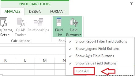
- Open the PivotChart Analyze tab and click Field Buttons in the Show/Hide group.
- Click Hide All to remove every button, or untick individual entries such as Show Report Filter Field Buttons, Show Legend Field Buttons, Show Axis Field Buttons and Show Value Field Buttons to keep only the ones you want.
The chart now looks like an ordinary column chart but is still bound to the pivot table. Filters, refreshes, slicers and layout changes continue to flow through. Repeat the same menu and tick the buttons again if you need them back.
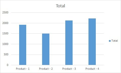
Chart types you cannot use for a pivot chart
The Insert Chart dialog for a pivot chart is deliberately shorter than the normal one. Any type that needs two numeric axes or its own statistical binning is greyed out or missing.
| Chart type | Allowed on a pivot chart? | Why |
|---|---|---|
| Column, Bar, Line, Area, Pie, Doughnut, Radar, Combo | Yes | One category axis and one value axis, which is what a pivot supplies |
| XY (Scatter) | No | Needs two numeric fields on two value axes; a pivot gives text categories |
| Bubble | No | Needs three numeric values per point |
| Stock | No | Requires a fixed high, low, open and close series order |
| Treemap, Sunburst, Histogram, Pareto, Box and Whisker, Waterfall, Funnel, Map | No in most versions | These newer types calculate their own grouping from raw data |
If Excel refuses your choice, the fastest workaround is to keep the pivot table and build a separate normal chart from its cells, as described below.
Change the chart type or move it to its own sheet
- To swap type, right-click the chart and choose Change Chart Type, or use Design > Change Chart Type. Pick any supported type and click OK. Combo lets you plot Sum of Revenue as columns and a second value field as a line on a secondary axis.
- To move it, right-click the chart and choose Move Chart. Select New sheet and name it, for example Dashboard, to place the chart on its own chart sheet, or choose Object in and pick a worksheet.
- Cutting the chart with Ctrl+X and pasting it on another sheet also keeps the link, so the pivot table can stay on a hidden data sheet.
Worked example: monthly revenue trend by supervisor
Open the course practice file and build this small report.
| Pivot area | Field | Chart role |
|---|---|---|
| Rows | Date, grouped by Months | Axis labels Jan, Feb, Mar |
| Columns | Supervisor | One line per supervisor in the legend |
| Values | Sum of Revenue | Line height |
- Build the pivot table, then group the dates by Months and Years using Group on the right-click menu.
- Click inside the table and choose PivotTable Analyze > PivotChart > Line with Markers, then OK.
- Select the chart and click PivotChart Analyze > Field Buttons > Hide All.
- Add a Product slicer from PivotChart Analyze > Insert Slicer and click a product.
Result: every line rescales to the chosen product while the axis keeps the grouped months. Add a chart title and data labels from the plus button beside the chart.
Pivot chart versus normal chart
| Feature | Pivot chart | Normal chart |
|---|---|---|
| Data source | A pivot table and its cache | A fixed range or Excel Table |
| Updates when data changes | Yes, after a refresh of the pivot | Only if the range or Table grows |
| Built-in filter buttons | Yes, and they can be hidden | No |
| Works with slicers and timelines | Yes, shared across charts | Only with an Excel Table slicer |
| Available chart types | Restricted, no scatter or bubble | All types |
| Custom series order or gaps | Follows the pivot sort order | Fully manual |
| Best for | Dashboards and changing reports | Fixed reports and statistical charts |
How to make a scatter chart from pivot data
When you need a type the pivot chart cannot draw, break the link and chart the numbers instead.
- Lay the pivot table out in Tabular form so every row is a complete record, then copy it.
- Paste it into a blank area with Paste Special > Values, or link the cells with GETPIVOTDATA so the helper range still refreshes.
- Select the helper range and choose Insert > Scatter (or Bubble, Histogram, Waterfall).
- Refresh the pivot, then refresh the helper range, before you present the chart.
The helper range approach also gives you full control of series order and custom formatting, which is useful for the presentation charts covered in the Basic Charts module.
Tips and common mistakes
- Format the chart normally. Titles, data labels, axis number formats and colours all come from the Design and Format tabs or the plus button, just like a regular chart.
- Sorting the chart means sorting the table. Sort the pivot field largest to smallest to order the columns; a pivot chart cannot be sorted on its own.
- Watch the subtotals. Grand totals are excluded automatically, but subtotals of an outer field are plotted and make one huge bar. Collapse the outer field or turn subtotals off.
- Do not delete the pivot table. Deleting it converts the pivot chart into a dead static chart with hard-coded values.
- Keep the pivot table out of sight. Put the tables on a hidden sheet and only the charts and slicers on the dashboard sheet.
- Refresh before you present. New source rows appear only after Data > Refresh All, and the chart follows the table.
- Hide buttons last. Do your filtering while the buttons are visible, then hide them once the layout is final.
Errors and how to fix them
| Symptom | Cause | Fix |
|---|---|---|
| PivotChart button is greyed out | The active cell is outside the pivot table | Click inside the pivot table first |
| Scatter and Bubble are missing from the dialog | They are not supported for pivot charts | Build a helper range and insert a normal chart |
| The chart does not change when new data is added | The pivot cache has not been refreshed | Refresh the pivot, or extend the source to an Excel Table |
| One bar dwarfs the rest | A subtotal row is being plotted | Collapse the outer field or switch subtotals off |
| Field buttons come back after a change | Individual button types were left ticked | Use Field Buttons and click Hide All |
| Formatting resets after a refresh | Preserve cell formatting is off for the pivot | Tick Preserve cell formatting on update in PivotTable Options |
Practice exercise
- Build a product-wise Sum of Revenue pivot and insert a clustered column pivot chart with Alt+F1.
- Drag Supervisor into Columns and note how the chart gains a legend and a legend field button.
- Filter to two products from the axis field button, then clear the filter from the same button.
- Hide every field button, then change the chart type to Line with Markers.
- Move the chart to a new sheet called Dashboard and add a Product slicer that also controls the table.
Key takeaways
- A pivot chart is bound to a pivot table, so it updates whenever the report is filtered, sorted, grouped or refreshed.
- Create it from PivotTable Analyze > PivotChart, or build table and chart together from Insert > PivotChart.
- Rows become the axis, Columns become the legend series, Values become the plotted numbers and Filters become a chart filter button.
- Field buttons filter the chart and the table together; PivotChart Analyze > Field Buttons > Hide All hides them without breaking the link.
- Scatter, bubble, stock and most of the newer statistical types are not available; copy the values to a helper range for those.
- Slicers, timelines and a chart sheet turn a pivot chart into a working dashboard.
Related lessons
- Pivot Table course hub
- Slicers and report connections
- Timeline filter for dates
- Pivot table, slicer and timeline styles
- Basic Charts module for normal chart types and formatting
- Excel Dashboard module to assemble charts and slicers into a report
- Microsoft Support: Overview of PivotTables and PivotCharts
Frequently asked questions
What is the difference between a pivot chart and a normal chart?
A normal chart plots a fixed cell range, so its series stay put until you edit them. A pivot chart plots a pivot table, so it redraws automatically when the table is filtered, sorted, grouped or refreshed, and it carries interactive field buttons. Pivot charts also respond to slicers and timelines shared with other charts.
How do I remove the filter buttons from a pivot chart?
Select the chart, open the PivotChart Analyze tab, click Field Buttons in the Show/Hide group and choose Hide All. To keep some of them, untick only the entries you do not want, such as Show Axis Field Buttons. Hiding the buttons does not break the link to the pivot table.
Why can I not create a scatter pivot chart in Excel?
A pivot table supplies one category axis and summarised values, while an XY scatter chart needs two numeric axes. Bubble, stock and most newer statistical types are blocked for the same reason. Copy the pivot results to a helper range with Paste Special Values, then insert a normal scatter chart from that range.
Can I change the chart type of an existing pivot chart?
Yes. Right-click the chart and choose Change Chart Type, or use Design and Change Chart Type on the ribbon. Any supported type can be applied at any time, including Combo, which lets you show one value field as columns and another as a line on a secondary axis.
Does a pivot chart update automatically when the source data changes?
Not on its own. The chart follows the pivot table, and the pivot table reads a cached copy of the source, so you must refresh it with Data and Refresh All or right-click and Refresh. Basing the pivot on an Excel Table means new rows are picked up on the next refresh without changing the source range.
Want the finished version? Ready-made Excel dashboards, trackers and VBA systems are available at NextGenTemplates.com.