Home>Blogs>Charts and Visualization>A Stunning Chart to display the 5 KPI Metrics together
A Stunning Chart in Excel
Charts and Visualization

A Stunning Chart to display the 5 KPI Metrics together

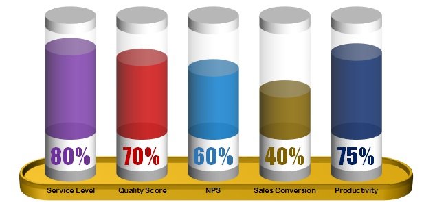
This is incredibly beautiful and stunning Chart to display multiple KPI Metrics together. In this example we have used 5 KPI metrics – Service Level, Quality Score, NPS, Sales Conversion and Productivity. You can any other metric in this chart. It can make your dashboard, report, or presentation more visually attractive.


A Stunning Chart for multiple KPI Metrics

Click here to download this excel file.


Watch the step-by-step tutorial to learn how to create stunning chart in MS Excel-

PK
Meet PK, the founder of PK-AnExcelExpert.com! With over 15 years of experience in Data Visualization, Excel Automation, and dashboard creation. PK is a Microsoft Certified Professional who has a passion for all things in Excel. PK loves to explore new and innovative ways to use Excel and is always eager to share his knowledge with others. With an eye for detail and a commitment to excellence, PK has become a go-to expert in the world of Excel. Whether you're looking to create stunning visualizations or streamline your workflow with automation, PK has the skills and expertise to help you succeed. Join the many satisfied clients who have benefited from PK's services and see how he can take your Excel skills to the next level!
https://www.pk-anexcelexpert.com

Leave a Reply