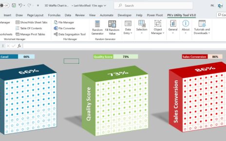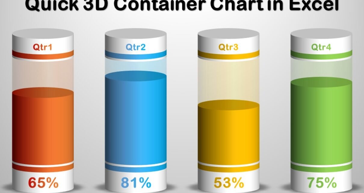
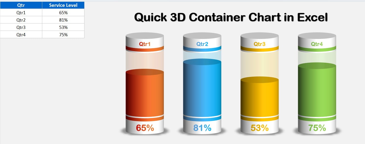
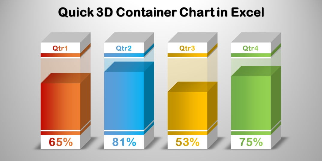
In this article, we have created a beautiful 3D container chart in Microsoft Excel. We have used a 3D Stacked column chart to create this chart. You can use this chart to show the KPI metrics like – Service Level, Quality score, Gross Margin, etc.
3D Container chart in Excel
We have created two versions here
1: Cylinder version:
Click to buy Quick 3D Container chart in Excel
2: Box version:
Click to buy Quick 3D Container chart in Excel
Visit our YouTube channel to learn step-by-step video tutorials
Watch the step-by-step video tutorial:
Click to buy Quick 3D Container chart in Excel